Sunday, 15 December 2013

Choosing of my book

As I am undecided about the book i want to do for my book cover, i have collected different covers and other books by the same author to give a feel of what i could explore in the making of my cover.
The books i have choose to look at are completely different. Lolita is a fiction, Oliver Sacks are non fiction books about psychology and the jungle book is a children's classic.


Moodboards
After looking at a variety of book covers for each of my books I have decided to use The jungle book because i thought could look at a collection of things and experiment using different techniques.


Monday, 9 December 2013

Type activity

For this activity we got given a list of different types of effects which can be used. These are negative, break, script, scrawel, illustrated, distort and warp. We had to apply this effect to the word. 


Saturday, 23 November 2013

Initial Ideas


Here are my initial ideas. I started off sketching a few ideas and then went on to developing my ideas within type. I tried to incorporate the key animals within the type. For example the black panther, Bagherra.
On our last lesson before the Christmas holidays we did a class activity where other people gave feedback to our work. My classmates preferred my idea where the word 'Jungle' is in the body of the panther. One of the feedback was to experiment using the type in different animals which are involved in the story such as the bear, snake, elephant, wolf or vulture. 
Here are a few experimental sketches of different animals I could use within my book cover.
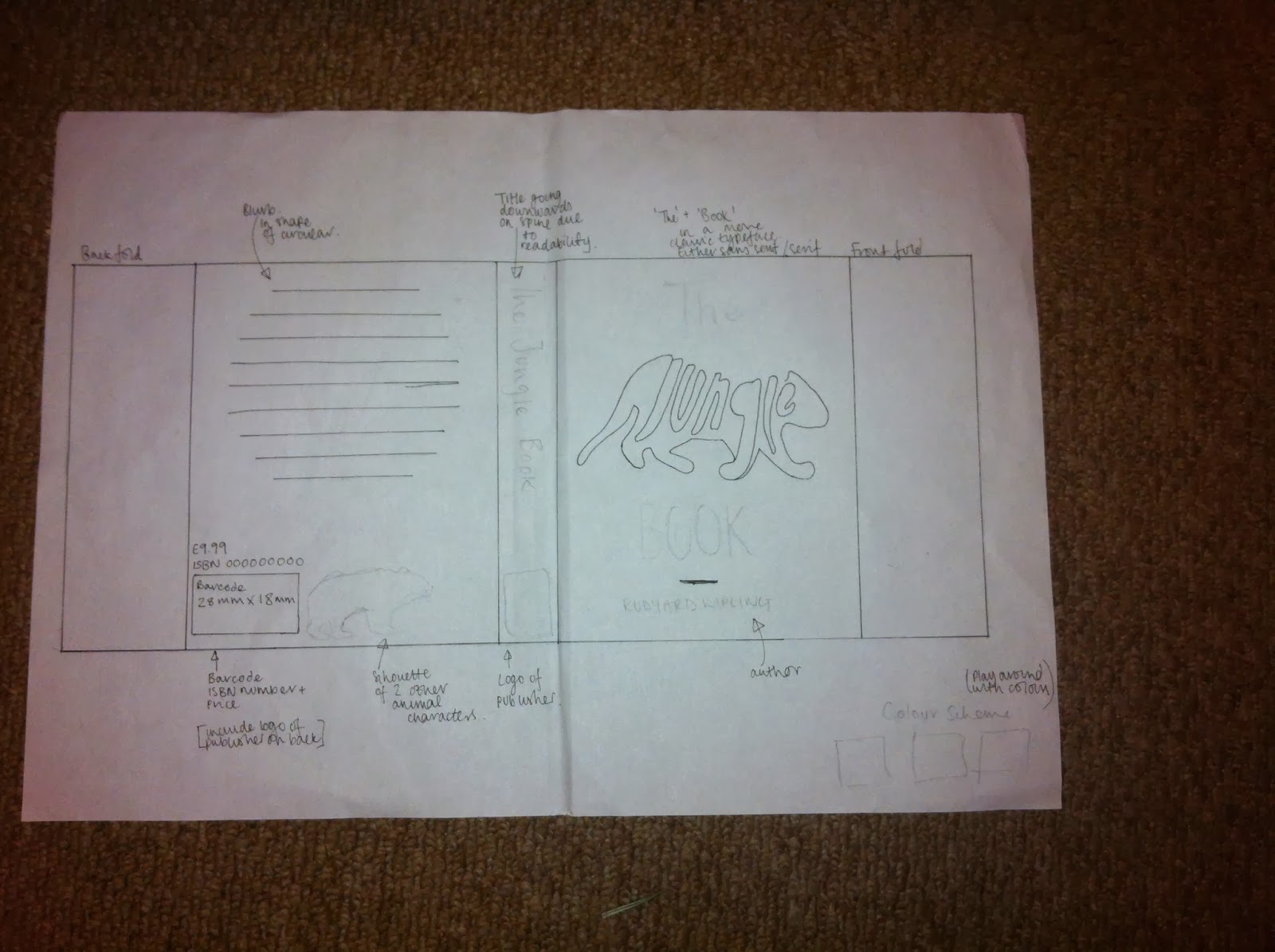
Here is a hand drawn idea of my entire book cover. I have included notes showing where what goes where. My next step is to scan in my panther imagery and then play about with different colour schemes and layout.
Above is my scan of the panther. Once I scanned it in I opened it up in Photoshop and played around with the levels to make the black and white prominent. I then went onto erasing all the markings which were on the paper to make it look crisp. I then opened it up in Illustrator and live traced it.


Above are a few improved drawings. I felt the type in the previous drawings wasnt shaped as well i would of liked into the animals.
Above is the vector for my bear sketch. Here I experimented with having the negative space as the type and the other as just a line vector.


Tuesday, 22 October 2013

Creating my Book Cover


The top image is the actual image i got off google. To make sure it was high enough resolution i changed the search tools to only search images larger than 2MP. Above are my colour choices for my textured image. The chosen one i picked is red. I originally wanted to use a green image but it didn't come out too well.


The above is two screenshots of my book cover. I decided to have the detail all white. This is because it stands out more than the black.


I changed my mind on doing the synopsis layout. The circle version is lacking in readability.
To make the first letter larger i used a tool in Indesign.


I felt my design was lacking something. I asked my classmates what i could add and they responded with a border. I wanted to refer back to my indian cultured mood board. I prefer the second one as it is more simple and isn't as over powering on the eye.